General
The Table widget is the first Elementor table widget to take advantage of the repeater control from the Elementor API. That’s the one where you can add items and have a bunch of controls inside it. Tables are great at displaying big amounts of data. However, we think Elementor should support tables as a layout element (like sections or columns) instead of a separate widget. One very important reason is that rendering many columns and rows for a table can take a bit of time using repeater fields.
Why use the Table widget?
The Table widget creates a responsive, sortable table inside which you can add your data. It provides you with a lot of options, supports icons and shortcodes and building it becomes very intuitive once you learn the basics.
How it works
To create your table you must first understand a few basic concepts surrounding how content is added to the table. By default, when you drag a Table widget into the Elementor preview area you get a table with one header, two rows and 3 columns. A table is made up of the header and the body, each with a separate section in the Content tab of the Elementor editor panel. To edit the header, go to Content > Header, to edit the Body go to Content > Body.
Adjusting the header
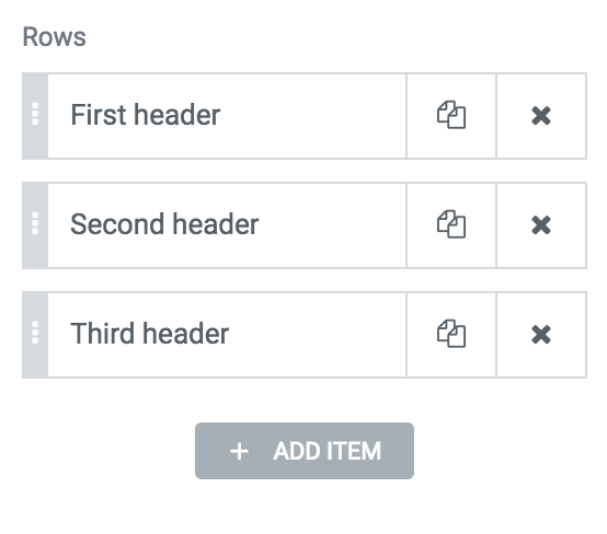
Start by going to Content > Header > Columns and adjusting the number of columns and their content. This is the header of the table.
We suggest you leave out other options for now until you get the right number of columns and rows, together with the content for the whole table.
Adjust the body
Go to Content > Body > Rows. You will see there are two types of labels for each item in the repeater field:
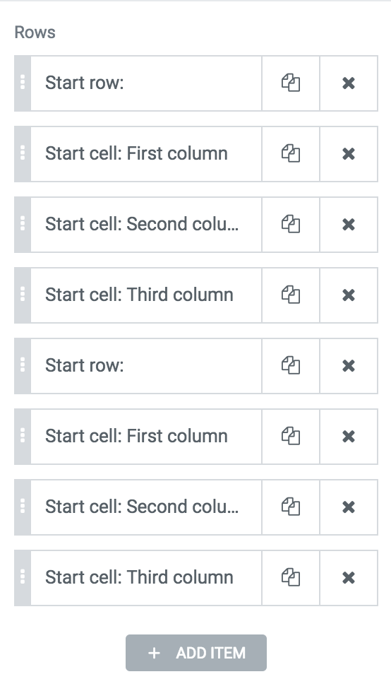
The “Start row” item signals the start of a new row. In this repeater field, you should always start with a row, although if you don’t we handle this situation and make sure the html code is not invalid. You signal the start of a new row by going into an item and set the control Start new to Row. Once you have a row item, any items after that have the Start new control set to Cell will below to that row. For example, if you have one row item and three cell items, this will output a table row with 3 cells.
Note: We use the term cell for accuracy because the term column refers to the whole column of the table spanned across multiple rows. Moreover, cells can span across multiple columns of a table, as described below.
Once you understand and get to the structure you need for the table body, you can move on taking a look at the options for each item. The Rows repeater control should end with an item set to Cell, not Row.
Settings
- Content
- Header — Adjust the header of the table from this section
- Sortable — Adds controls inside the header of the table so that the user can sort the content of the table
- Responsive — By default tables in HTML are not responsive. This means the columns do resize but get squeezed and control is not easily readable. A commonly accepted method for creating responsive tables is converting the header row to a column. So instead of seeing the default table you will get a cell header to the left of any cell and cells converted to rows.
- Hide on mobile — You can choose to hide the headers of the table completely on mobile. This is helpful if you table doesn’t really require headers and you can do without them.
- Auto Mobile Headers — For each cell item inside Content > Body > Rows you can define what the mobile header will be. If you enable this control, the table will try to fetch for each cell the corresponding header. We say “try” because sometimes you may have cells that span across multiple columns.
- Mobile Display
- Columns — This shows the headers to the left of each cell, in a separate column
- Row — Show the headers on top of all corresponding columns, in rows.
- Header — Adjust the header of the table from this section
- Header & Body Cells — Applies to both Header and Body sections
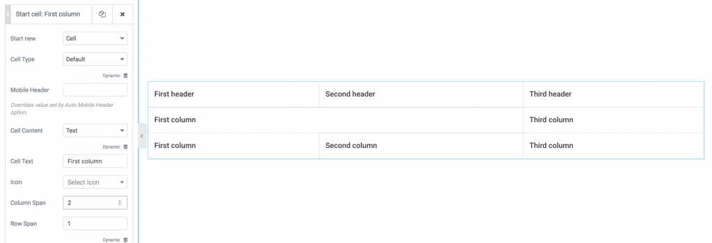
- Cell text — The content of the header cell
- Column span — How many columns should this cell span across.
- Rows span — How many rows should this cell span across
- Read more about columns and rows span.
- Mobile header — Defines what header should a certain Body cell have on mobile.
- Style
- The style controls for this widget are straightforward. If you don’t understand how to achieve something please let us know.
FAQ
Can I add an image inside a cell?
For now, no. We’ll add this in the near future.
I don’t understand what Cell span refers to.
Spanning refers to the a certain cell occupying more than one column in a table. If you have a table with 3 columns and, inside it, a row with only 2 cells, you can have one cell span across two columns, like this:
Can I link content in the table?
Yes. Go to each item under Content >Body and set the Link control.