General
With the Global Tooltips extension you can add a tooltip to any widget or section and define how they look globally or per tooltip.
Why use Global Tooltips?
Some of our widgets, like Buttons or Hotspots already make use of tooltips. But sometimes you will need to show a tooltip when hovering an image from the Elementor Image widget, for example. Global Tooltips let you do just that. It adds controls to setup tooltips for ALL widgets, no matter where they come from (be in Elementor, Elementor Pro or any other third party Elementor addon).
How it works
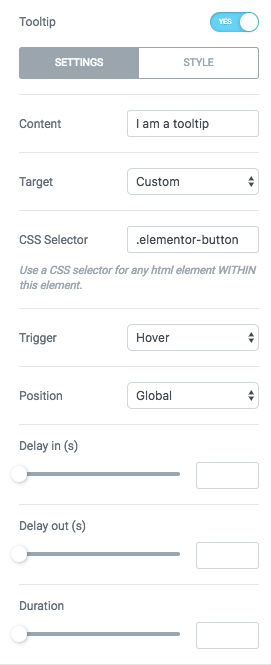
To get started with adding a tooltip to a widget, you will find the control that enables it under Advanced > Extras > Tooltip. Set this control to YES and all the options will appear, along with a tooltip with default content that is triggered by hovering the widget.
Settings
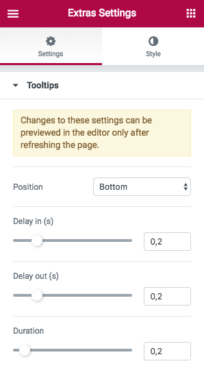
Global Settings
You can define a bunch of useful settings for all tooltips, then override then on a per element basis from the area described above. To modify global settings, you will need to go to the Elementor global settings panel by clicking on the burger icon on the top left of the editor sidebar. From there, click on Extras and select either the Settings or Style tab and open the Tooltips section within.
The following options are available and apply to ALL tooltips on your site:
Settings
- Show to — Where you would like the tooltip to appear. By default, it appears to the bottom of the trigger. If for whatever reason the tooltip will go out of the viewport when a certain position is selected, it will reposition itself automatically.
- Show at — Defines where the arrow should be in relation of the tooltips content. If you set Show to to bottom or top, you can have the arrow align to the Center, Left or Right (horizontally) of the tooltip. If you set Show to to left or right, you can have the arrow align to the Center, Top or to the Bottom (vertically) of the tooltip.
- CSS Position — Can be absolute or fixed. If the tooltip is tied to an element that is fixed on the page, it makes sense to have the tooltip be fixed as well so it doesn’t scroll with the page, leaving the target separate from the tooltip. In such cases, set this to Fixed.
- Delay in — Time from the trigger action (hover or click) until the tooltip appears.
- Delay out — Time from the trigger action (mouse out or click outside of the tooltip) until the tooltip appears.
- Duration — How long should the in / out transitions take.
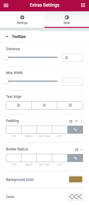
Style
- Distance — Defines the distance between the tooltip and the elements which is hovered, clicked
- Maximum width — Sets the maximum width that the tooltips should have. By default, the width of the tooltip is determined by its content. If the content length requires the tooltip to be wider, this value will force the tooltip to have a maximum width and break the content into multiple rows.
- Text Align — Alignment of the text inside the tooltips
- Padding — Distance between the edges of the tooltip and its content
- zIndex — The default zindex of all tooltips
Widget Settings
You can override any of the above global options at an element level. Under Advanced > Extras > Tooltip, beside the ones presented above and which are the same, you will find the following additional controls:
Settings
- Content — De text that appears in the tooltip. This control supports HTML and shortcodes.
- Target — What triggers the tooltip. Can be:
- Widget — The whole widget will be used to trigger the tooltip
- Custom — A custom CSS selector
- CSS Selector — This is used to define a custom CSS selector in case the Target control is set to “Custom”. Provide a class that exists within the current widget. For example, if you have a Pricing Table widget and you want the tooltip to appear when you hover on the button from this widget, just input .elementor-button in this field.
- Trigger — This is the event that triggers the tooltip. It is responsive and you can define it for mobile and tablet separately. Can be:
- Mouse Over — Tooltips appears when the target is hovered and disappears when the mouse leave it’s surface
- Click Target — Tooltip appears when the target is clicked ( be careful and make sure the target is not a link, otherwise both events – tooltips and link – will trigger simultaneously )
- Page Load — Open the tooltip when the page loads
- Hide — This is the event that hides the tooltip. It is responsive and you can define it for mobile and tablet separately. Can be:
- Mouse Leave — Hide the tooltip when the mouse stops hovering the target
- Click Outside — Hide the tooltip when a click is initiated outside the target on the page.
- Click Target — Hide the tooltip when the target is clicked.
- Position — Overrides the global position for this tooltip.
- Delay in — Time from the trigger action (hover or click) until the tooltip appears.
- Delay out — Time from the trigger action (mouse out or click outside of the tooltip) until the tooltip appears.
- Duration — How long should the in / out transitions take.
Widget tooltip options
- Duration — How long should the in / out transitions take.
Style
- Max Width — De text that appears in the tooltip. This control supports HTML and shortcodes.
- Distance — Defines the distance between the tooltip and the elements which is hovered, clicked
- Arrow — Wether or not to show the tooltip arrow